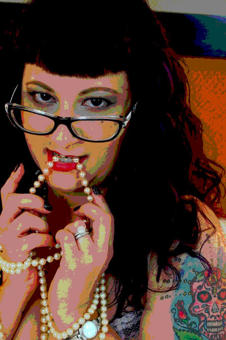
Tiffany Poster
Original image taken by my friend Amy Rae, of Tangled Photography.
I'm working with Gimp and trying to get up to speed on it's features and transfer some of my rusty PhotoShop skills into Gimp. My wife, Verlenne, recently helped Amy pose Tiffany, the model for this image. When I saw it I really was struck by how the colors had a 1950s look to them. I decided I wanted to do some processing to limit the color levels and create a poster-like image. The before and after results are shown below, left to right, respectfully.
So which image do I like better? Certainly the original image conveys the 'naughty libranian' look. The poster conveys the 'step back in time' look and feel of the movie posters of the 50s. It is difficult because these images, seen side by side, each convey a different, yet dramatic feeling in my mind's eye. The more important question, to me at least, is why do processing effects radically change an image's impact and message?
Thanks to Amy Rae and Tiffany for allowing me to publish this.
Equipment
Camera
Sony SLT A-65, hand-held, studio lighting
Settings
Unknown
Processing
Color levels adjusted to limit dynamic range and 'posterize' the image using Gimp.

